

Recommendations for the Best and Worst Colors for Your Website
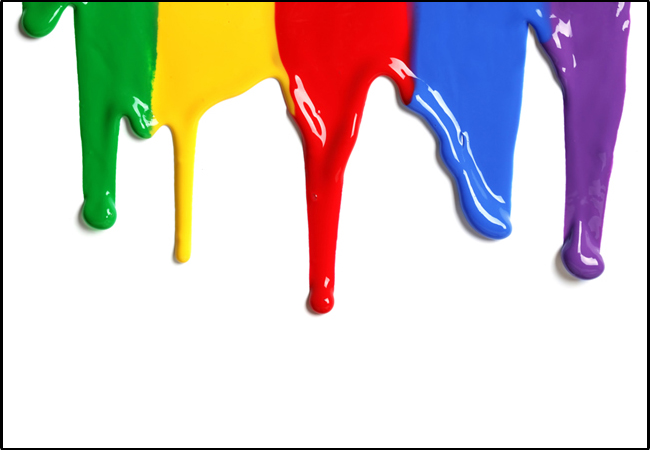
Table of Contents
I believe ignorance of colors while designing a website would overshadow the impact you want on your website. Colors undoubtedly have psychological effects on minds of the viewers. The look and feel of the website is essential factor to determine its value. Poor colors and themes have a serious impact on the visitor resulting in a negative effect on your business.

In order to brand the product and communicate the message, the visibility and readability is crucial which depends on the use of colors.
A few attributes of colors that affect the visitor on the website. Let’s look at them:
- Color combination motivates or demoralizes website visitors
- It can have profound impact on the customer and might convince them to buy products
- Colors not only impresses but also improvises mood
- Use of appropriate colors can be highly appealing
While selecting colors, too many questions come in mind. What would be an appealing combination; will it catch the attention of the visitors? Will the use of this color allow the visibility of the content; and so on.
We tend to trust non-verbal indicators rather than verbal ones. Colors have different meanings in different parts of the world. Following combinations, I feel, would be useful and effective when put it into a website. Some of the best color combinations I would recommend.
Colors used for links, graphics, text and background must complement each other. If you prefer dark shades go for black and white; it is a basic color combination. In addition, you can add Red to balance the combination. Black should not be the dominant one. You can also go for black and orange if you want. You can use red, as it is catchy; the punch lines on sales oriented websites use red as the only color. Excess use of red should be avoided.
White can be readily paired with any other. You can use it in the background to make the text more effective and readable.
You can go for green color as it is considered as color of nature. Health and natural products business tend to utilize green for communicating with customers. This perfectly blends with their products.
Blue is dominant in the banking sector website as it is the symbol of faith.
The next best combination I would recommend is black, green and white. The combination works particularly well if proper balance is maintained between the three colors. Usually Green should be the dominant color followed by black and white.
I mostly find it difficult to differentiate between best and worst colors for websites, but there are certain combinations not at all compatible for the websites. I would recommend not to use the below mentioned color combinations.
Avoid the use of purple background with green text, as it looks horrible. I personally don’t like to see websites with these colors.
The combination of light colors, for e.g. white background with yellow text, causes eyestrain, which will make the visitors leaving the site in no time. This will ensure loss of sales faster because of eye straining text.
Blue and red combined would work at times, but not for a website or an article. This combination would compel the readers to leave the page.
Use of two dark colors at one place would make the web page exceedingly dull and lazy. Avoid the use of orange for background and dark green for the text.
Another unpleasant combination would be brown background with red text. Light blue background with some green text is also unacceptable when it comes to a website. There are many such examples of poor color-combo usage. It is embarrassing if the visitors overlook your products and services, because of excess or poor color combination.
You must always consider best and worst colors for the website. To conclude I would recommend the use of four or five colors, plus white and black for balancing the color combination. Excess use of colors and especially awkward colors are not only irritating but they also distract the user, which is certainly not advisable for your website. Professional web designers know the basics of color combination to be used on the website and hiring them can help you avoid the terrible circumstances.